Eco Track - Dashboard Design
Designing a smart, user-friendly dashboard to simplify energy tracking and promote sustainable habits.
Role
UI/UX Designer
Industry
Tech
Duration
2 Weeks
Other projects
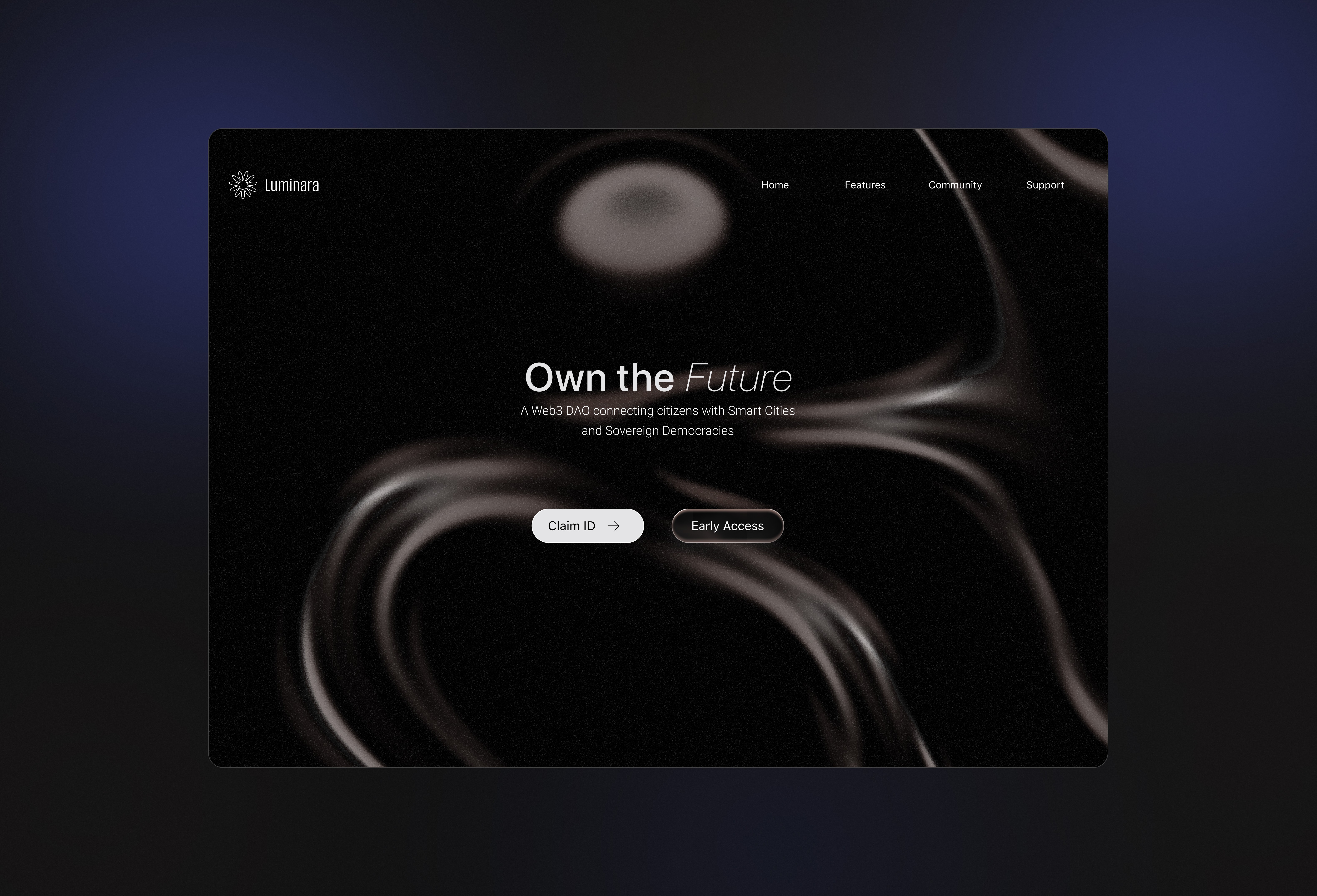
Luminara - Web3 Platform Design
A sleek, modern interface reimagining governance and community in the digital age.
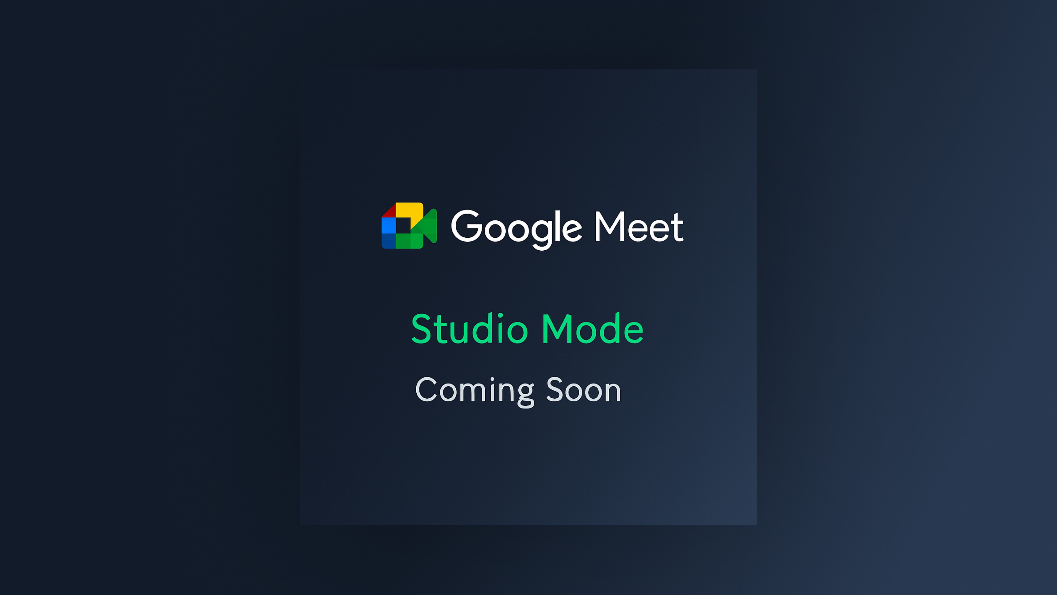
Google Meet - Studio Mode (Case Study Coming Soon)
A premium audio feature designed for musicians, creators, and professionals who need high-fidelity sound during online meetings.
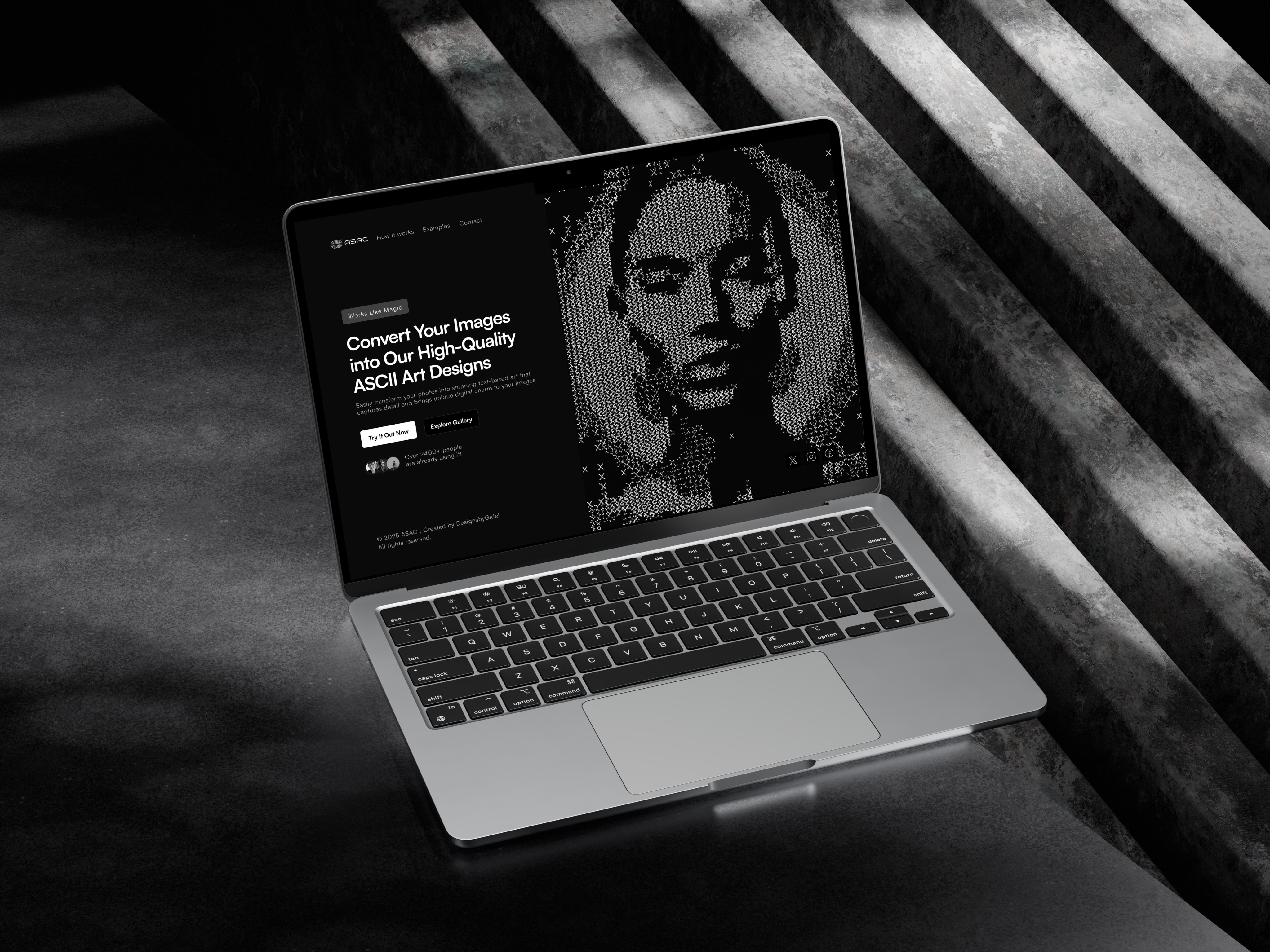
UI Design: ASAC – ASCII Art Converter
Transforming ordinary images into visually stunning ASCII art using contrast, structure, and creative character mapping.
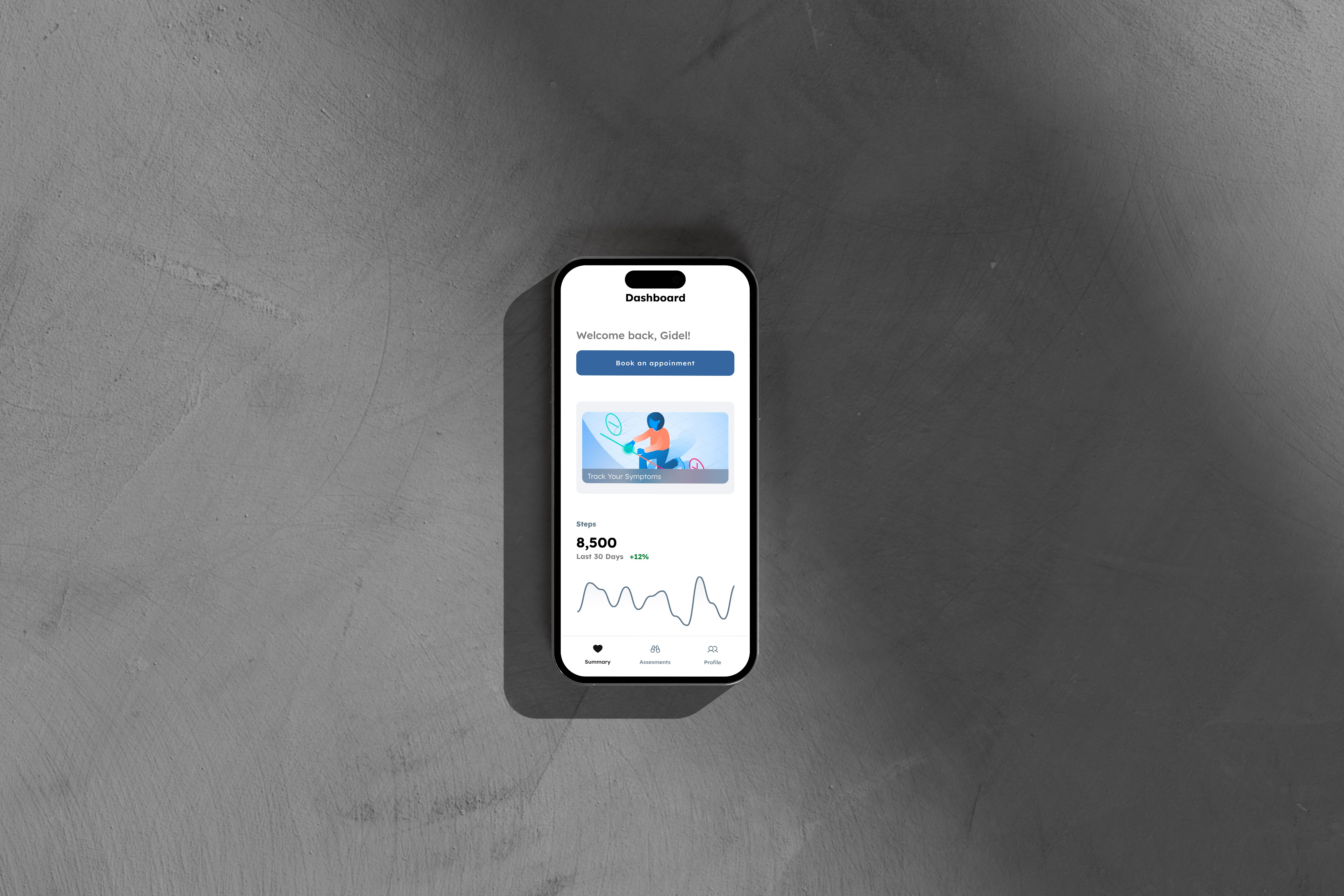
Product Design : Tracto Healthcre App
Designing a healthcare app to simplify medical tasks and connect users with doctors, from research to prototype.
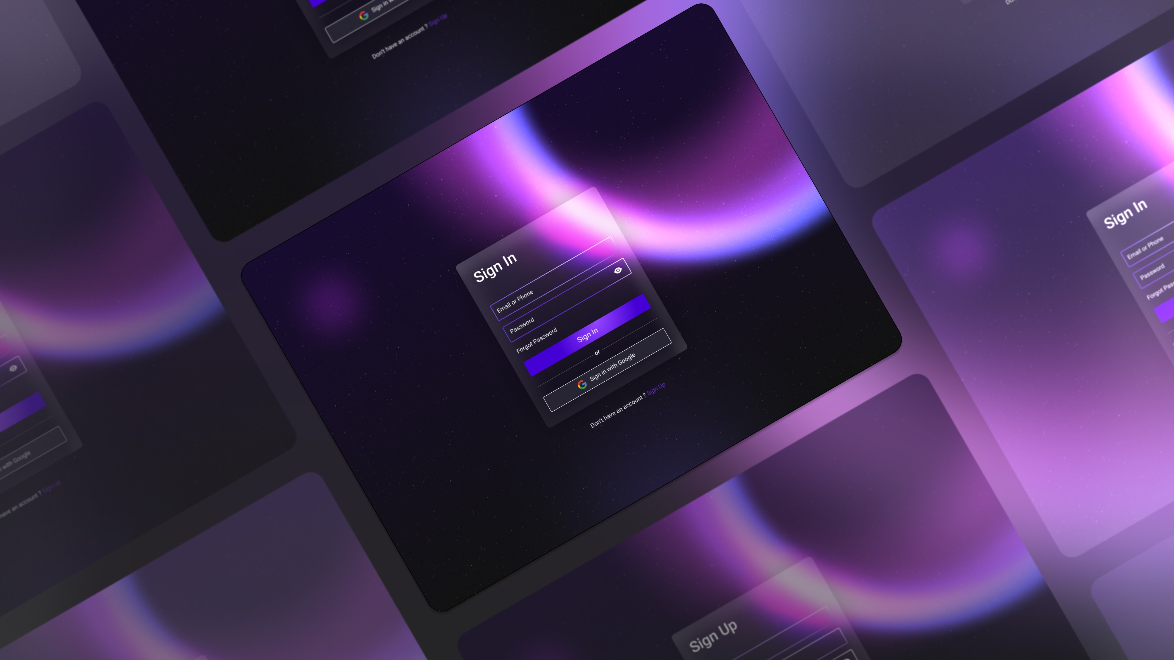
UI Design - Login/Signup
Streamlining access with a sleek, minimal interface for a cosmic-inspired authentication flow.